Bond appears and which I guess is the start of 'likenesses'. Bond appeared simply because he was on the cover of the Radio Times when I was doodling. I think the red for the face is quite striking, but I later decided that keeping coming up with a different colour for skin tones was going to be tricky when Finngr only has 8 colours, so I eventually settled on grey.
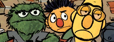
Matt Smith as the Doctor barely looks like him, but I think the big nose and sweeping hair is enough to make the point. Also, the muppet nose seems to make it's first appearance. I've always felt noses drawn with an outline can be a bit weird looking, and I've started to think of noses as interesting shapes.
My version of Batman is probably closer to Adam West than Frank Miller, so this has the fun of West and a pose that's taking the mickey from one of the Dark Knight covers... when I posted this one on twitter I called 'Batman playing with a balloon'.
I'm a huge fan of Mr X in a variety of his incarnations..... he's very easy to draw and make look striking.
Wally Wood/Al Williamson/Frazetta style 50's tearaway. It's not great, but it was my first go at adding detail to one these and I was quite surprised to see that I could.
Could I fingerpaint from life? My daughter eating cereal say still long enough to prove I could. I still really like this, but I can't put my finger (*groan*) on exactly why.
With Jon Snow the whole portrait thing took hold, it doesn't look like him, but fingerpainting doesn't really allow for that much control, particularly when you can't zoom and the like, or at least that's what I thought at the time. Like the Matt Smith pic, it seemed best to latch on to some clear aspects of the character, in Snow's case it was the mopey face and amazingly tousled hair. After doing one Game of Thrones character, I thought I might as well do more.
Joffrey is barely recognisable, but he looks smug and sinister and that was enough for me.
Robert Baratheon doesn't seem a bad likeness, I tried a different colour on his face to try and capture his florid look, it makes him look more like a muppet, but that's ok I think.
Ned Start probably look a bit better drawn but there's neither likeness or 'key recognisable points', and I was a bit disappointed to be sticking so close to reference - the previous pics had been done either off the top of my head or just looking at a few different refs and making up my own version.
At the time I wasn't happy with Tyrion Lannister as a drawing or a likeness, but looking at it now, it looks ok. I think the benefit of grouping the characters together is that it becomes obvious who is who by contrast and association without worrying too much about getting an exact likeness and just focusing on the character..... maybe that's the problem with Ned, the others have some kind of expression that tries to sell who they are, Ned just looks all noble and stoic. Tyrion could've done with a better try at capturing his character, he is one of the best things about Game of Thrones after all.
More Game of Thrones fingerpaintings in the next post......


No comments:
Post a Comment